
This is a map of Collier County, which has been affected by multiple hurricanes throughout the years. The map shows the roads of the area. Each block is given a population amount, lighter is less, darker is more. You can see that much of the population is around the western coast. The light purple area stretching out from the coast is the storm surge from an category 3 hurricane. Much of the populated area on the western coast is affected by this storm surge.

This map shows the risk of Oxnard from a tsunami. The red area is the tsunami danger zone. Schools in this area are yellow, medical facilities are in red, and emergency facilities are in green. This beautiful map was made with holiday colors. Tis the season.

This is a 3D depiction of a 100 year flood on the UWEC campus. To get this, I took the 3 ft elevation ground data and used that as a base height for the ground and flood levels. I also added the UWEC buildings and gave them elevation to have them pop out. This is the same 100 year flood map as the first, but just a 3D rendering.

The Eau Claire area in a 800 foot flood. Almost half the city is under water.

Same map of the Eau Claire area as below, now with a 790 foot flood line. Now you see almost all of downtown Eau Claire is flooded.

Here is a map of the Eau Claire area. The blue on the map is the area affected by a 100 year flood, that would be a 780 foot flood. The pink areas are UWEC buildings. As you can see, much of the UWEC lower campus is flooded along with many blocks of residential zones.

In the center of the map, you can see the parcels that were sectioned off. The red to yellow to green colors indicate the slop of the land. Red being steep and green being more flat. Imagine houses being in this area. These parcels fall at the foot very steep slop. Any development done in this area will only undercut the soil and encourage a mass wastage event even more. Add a storm with large amounts of rainfall and you are begging for a disaster. It is no surprise that these houses were destroyed by a mass wastage event.
  |
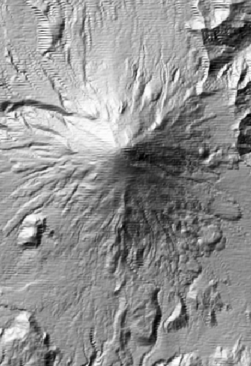
| This is a map the Forest Falls area. This is an analysis of slop angles. The darker the gradient, the sharper the slop angle. So black is a slope angle of 30%, gray is 60% and white is 90% |
 |
| This a picture of Mount St. Helens before the eruption. It looks like your average mountain. |
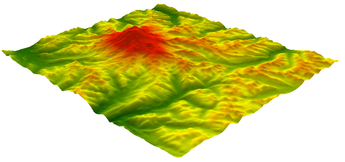 |
| Mount Rainier again with a color scheme for elevation. The scale goes from dark green for the lowest elevation to yellow and then red as the highest elevation. |
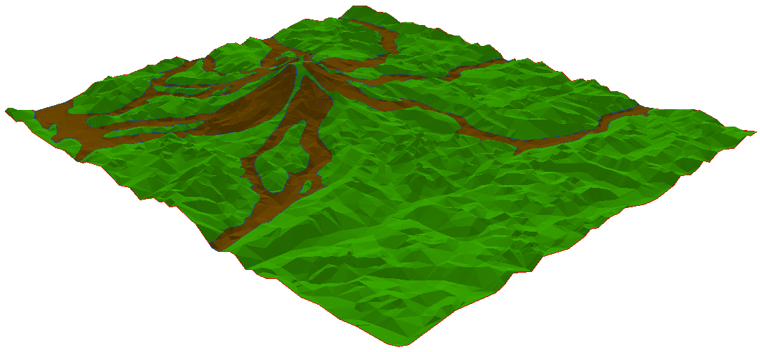 |
| This is the same mountain as before, with 3D rendering enabled. The brown areas represent the lahar flows down the mountain. |
 |
| This is a flat version of Mount Rainier. It is hard to tell where the peaks and valleys are located. The light region in the upper left is a large peak, the black lines are valleys. |

This is another map of Northridge showing building damage density with a peak ground acceleration overlay. Most of the areas where there were high amounts of building damage also received high amounts of ground acceleration. This shows that the PGA exceeded what the buildings could withstand and caused them damage. This is something that is very important to keep in mind for the future when building in this area. Buildings should be able to withstand earthquakes with high PGA to lessen the intensity of this natural hazard.

This is a map of the Northridge area after an earthquake. The blue areas represent building damage density. The darker the blue, the more damage the buildings in the are received. As you can see, buildings in the Northridge area and the area to the south of West Hollywood, received high amounts of building damage. The second layer represents liquefaction of the ground. Green is moderate, yellow is high, and red is very high. The Northridge area had high amounts of building damage near ground that falls in the very high category. Buildings around this area were not prepared for this even and this lead to a higher amount of building damage. This made the affects of the earthquake much more intense.

Blue dots represent urban areas with a 10% probability of exceeding .10g/50 years. These areas are more prone to earthquakes and a disaster prevention measures are needed before a catastrophic even happens.
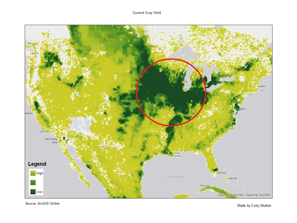 |
| The circled area above is where much of the crop production is in the U.S. Below is a map of droughts in the U.S. It can be seen that most of the crop production will not be affected by the current drought. |
 |
| Data courtesy of NSIPP Weather Forecast Made with ArcMap |
 |
| This is a map of countries hit by tsunamis |
 |
| Tectonic Plates map of Middle America |
 |
| This was my first game. Trying to save lives. |
To try and save as many people as possible, I
tried to put all the buildings up high in a safe place and used the reinforce
and raise foundations upgrades. I also
upgraded everything in community center to warn the citizens. Lastly, I put up natural defenses to try and
reduce the effects of the tsunami after it reached land.
 |
| My second game. So many cartoon deaths... |
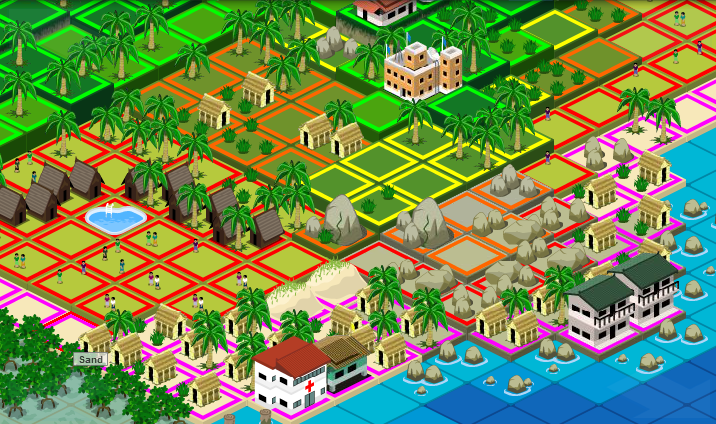
To cause as much destruction and as many deaths as I could, I placed the hospital, school, hotels and all the houses right
on the coast, in the most high risk areas.
I did not upgrade the reinforcements or the foundations on
anything. I also did not build any sort
or defenses, I actually build over top of them.
 |
| Wildfire Setup |
For the wildfire scenario, I placed moist trees everywhere around
buildings and tried to cut off as many paths that a wildfire would take. I upgraded the hospital, community center,
and schools to educate the citizens about a wildfire disaster.
For the flood scenario, I decided to put everything as far up the
mountain as I could, thinking it would be above the flood line then. I also put an earthen levee all around the
river in hopes that it would block the flood from spreading.
 |
| Hurricane Isaac terrorizing the Gulf |
No comments:
Post a Comment